Garmin has got a Forerunner/Fenix problem. It’s not a big one, but it’s a problem nevertheless.
The User Interface (UI), when navigating around the watch, is a charitable “not great”. Often it doesn’t look good, often it’s impossible to find things, often the repetitive strain injury on your wrist is further worsened as you contort your hands, fingers and brain around Garmin’s 5-button interface.
But, hey!, at least they’ve got 5 buttons and when you are IN a workout profile and then, whilst exercising, the buttons, screens, layouts and presentations of the sports metrics are actually good and sometimes great.
Widgets
You are probably a Garmin watch owner, so you already know that the bottom two buttons on the left-hand side scroll through a customisable list of widgets and you will know that a widget can provide access to a wealth of further info like ‘your heart stats’, ‘your recovery stats’ or the ‘music library’.
Let’s be frank. Widgets don’t look pretty. They don’t even sound pretty. And they require you to press another button to drill down into the more interesting and useful stuff that hides below.

Widget Glances
More techy Widget Glances info here
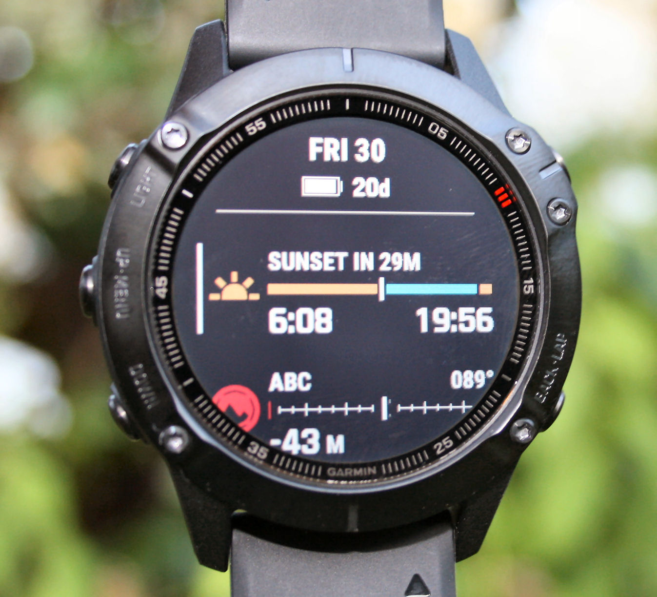
So, back in August(ish) I used the new widget glances as they were rolled out onto the Fenix 6 and now Fenix 7. Like the images above and immediately below…
As you can see, widget glances are a whole lot prettier than boring-old widgets. They are also more useful in that a widget glance has some aspect of ‘live’ information displayed instead of a previously static title. So, for example, the “MUSIC” widget now shows rich WIDGET GLANCE information about the current track, the album it comes from, how long the song is and how long to go. Which is pretty cool. And in the image above, you can see that today’s SUNSET and SUNRISE times are given on the widget glance along with the number of minutes to sunset.
In my opinion, widget glances DO improve the UI and User Experience somewhat. It’s both an aesthetic improvement and also an improvement made to slightly reduce the overall number of key presses that are required to get at the information.
There’s always a HOWEVER or a BUT.
However, widget glances have a different look and feel than much of the rest of the interface and, as we shall see in a minute, they don’t look quite so good on smaller screens, like that found on the 945.
I don’t profess to be a graphic designer, interface designer or software engineer (although I do know a little bit about these things) yet what I can’t figure out is how someone expert in their field has cobbled together all the different aspects of Garmin’s watch designs and that someone INexpert in this field (me) can see that there’s something wrong with it all. Maybe the answer lies in the evolutionary nature in which the Forerunners have come to be what they are today?
Widget Glances on the 945
Update Your 945 to Widget Glances NOW – Here’s How
Despite all of that, I have been looking forward to the arrival of widget glances on the Forerunner 945. I updated to v4.06 of the firmware but nothing appeared, so I moved on in my sporty, somewhat techy, life. Then I remembered that, maybe, just maybe, I needed to turn them on. Ah, indeed so, just as the software notes say, “The option to enable is found in the Widgets menu.” I’m sure you read those as frequently as I do. So you install the firmware and do this
- Long left middle-press
- Press UP 16 times (seriously) to get to ‘Widgets’ (and yes I know what someone’s going to comment on below about pressing down instead 😉 but that’s what I did the first time…user interface? remember?)
- Press enter to enable Widget Glances


Let’s look at the 945 and Fenix 6, apologies for each displaying different widget glances as that makes these two images slightly less easy to compare.
The screen size of the Fenix 6 is bigger than the Forerunner 945 and just seems, to me, to look that little bit superior in how it presents the widget glance ABOVE and BELOW the central widget.
You might week be wondering what this year’s Forerunner 955 LTE has in store for you. Already you will realise that, out of the box, it will have widget glances up and running but a little bit of further thought will tell you it has LTE (although maybe you’re not quite so sure what it means) 😉 and then a mini leap of faith will tell you that it almost certainly will have a larger screen…just like the Fenix 6. As to what other features are on the Forerunner 955 LTE and what LTE actually means in the context of a triathlon watch are other matters entirely – very interesting ones, if I may say so. So just imagine it does NOT make and take audio phone calls and then think what it could do with LTE ie with all the LTE connectivity stuff it could do AS IF you had your phone with you in a race (which hopefully you never do).
Reader-Powered Content
 This content is not sponsored. It’s mostly me behind the labour of love which is this site and I appreciate everyone who follows, subscribes or Buys Me A Coffee ❤️ Alternatively please buy the reviewed product from my partners. Thank you! FTC: Affiliate Disclosure: Links pay commission. As an Amazon Associate, I earn from qualifying purchases.
![]()
would say the whole UI is a over the time doctored mess, starting with the font Garmin uses that is not optimized for the screen resolution, lot’s of unused space on most if the screens itself in watch and in excercise mode and several inconsistencies in the UI flow e.g. toogle buttons or ok/cancel screens on the same watch, having for example and drop menue coming from the top with sensor status during start of an activity that blocks most important part of your carefully designed screen metrics is a weird layout, look at Suunto (particular their font usage on low resolution screens) and you have an case example of intelligent UI design with limited ressources
for me, the widget glances are not usefull, it’s to small for me, i wear varifocals, could be, that i have to renew my glasses, but if some day there come a better screen resolution then i think they would be nice! 🙂
Technically, sorting out the UI should not be difficult. Even junior developers should be able to move screen outputs around. Any reason why Garmin is not sorting it out? They did after all release an AMOLED screen watch so they obviously care about looks.
Garmin watches has a serious problem. 14 months ago i parchaded a forerunner 30 within3 months the strap was falling apart. The gave me a new one and they said it was a factory default, the same new watch in 6 months time i experience the same problem again it was replaced. After 6 months again this time it was the same problem plus the watch was now freezing when thete is an incoming call and it froze twice with no incoming calls the repairs/technician report says its a water resistant issue. Again ive been given a new watch witch still freezes when there is an incoming call andbi was told that the technician are still busy trying to figure out what’s the cause of this
Bigger issue is the incredibly inaccurate wrist heart rate monitor when in vigorous exercise where the heart rate rises above 120 + bpm. A quick skim of the Garmin Fenix 6 forum reveals hundreds of not thousands of issues.
indeed so.
a quick skim of EVERY SINGLE garmin ohr review i’ve done also will say the same. I say how i find it on the accuracy …i’m a consumer like you with no PR samples from garmin…I dont even get press releases.
Unfortunately, in spite of all its shortcomings, the Garmin Fenix line and the forerunner 945, are by far the best sport watches out there. By far. Suunto and Polar, for whatever reason have not dialed it in and they kept skipping on important features like ant+ , looking at you Vantage V. Also, setting the watch up without the need of a phone is more important than most watch companies want to believe. There’s a reason Garmin rules the roost and nobody else comes close. They know what they’re doing.
yeah, i generally agree.
garmin misses out on accuracy tho. and that’s one factor that the ‘wanna-pro’ sports person wants…then again, how big is that market?
and the 5-button thing is ALSO more important than other comapnies seem to think
The menu layout is ludicrous and the attempt was to mimic an Apple watch. Why want I want notifications whilst running a Marathon. The handbook can’t be bothered to produce a menu layout.
eesh, as much as i dont want to like apple; if garmin tried to emulate the AW they failed BIG TIME IN BUCKETS
I don’t have a strong preference on glances, but they really don’t save any key strokes like you and DCRainmaker keep claiming. You save one key stroke to get the 2nd widget on the screen, but to actually drill in, it’s the same as before as you need it in the center spot. Further, you now have to drill in more often since each glance only gets 1/3rd of the screen to display stuff. Sometimes that’s enough, often it isn’t. And then you need an extra button press to get back to the WF. I do agree the glances tend to look “refreshed”, but they could have done that by improving the looks of the full screen widgets, which they should do anyway.
surely it saves a click here or there. you don’t ALWAYS HAVE TO drill in for all the info
minor saving I agree