new Whoop Home Screen
More: Detailed Whoop 4 Review + Accuracy Tests
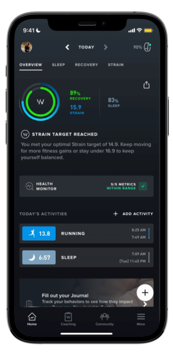
The new WHOOP home screen redesign is a significant change that arguably makes it easier for WHOOP users to track their fitness and health data. The new home screen includes a number of features that make it more aesthetically pleasing and quicker to use including:
-
-
- A new action button (the ‘+’ button) – a quick way to start a workout, access the journal and a few more things. This appears on all screens
- Battery charge status (at the top)
- A personalized overview of your day. This includes your Strain, Recovery, and Sleep scores, as well as your heart rate, HRV, and respiratory rate. This information is presented in a clear and concise way, making it easy to see how you are performing overall.
- Quick access to important metrics. You can now easily view your overall heart rate, HRV, and respiratory rate on the home screen, without having to navigate to other screens. This makes it easier to get a quick overview of your fitness and health status. Plus each of these items can be tapped to give more detailed information including trends.
- Personalized recommendations. WHOOP will now provide you with personalized recommendations throughout the day, such as suggesting a target Strain or behaviours to consider based on your Recovery.
- Aesthetic Improvements to Stran vs Recovery Weekly Trend Graph – plus the new ability to drill down from there to the details
- Minor re-jigging of the bottom bar menu – easier access to Coaching
- Minor re-jigging of the top-bar menus – adding more priority to sleep
- Future Proofing. There are some fairly big changes still on the way for Whoop. the new design is ready to accommodate those
-

It’s clearly a big change. I like the new design, which shows more data on the screen. However, new users of Whoop may find the amount of information on the screen daunting, and navigating to more detailed insights is not always intuitive.

Make Your Own Comparison
The Whoop 4 home screen contains links to over 20 more screens.
The flow works exactly as shown on this 4×2 matrix of screens. Swipe left or right for different views as you move from one of these screens to the next. Then swipe up or down for more or less detail…


Old App Screen Layout
This is what is looked like before


Take Out
On the whole, it’s a sleek and useful improvement. The changes don’t make it any easier for a new Whoop owner to learn the breadth and depth of the available insights.
Reader-Powered Content
 This content is not sponsored. It’s mostly me behind the labour of love which is this site and I appreciate everyone who follows, subscribes or Buys Me A Coffee ❤️ Alternatively please buy the reviewed product from my partners. Thank you! FTC: Affiliate Disclosure: Links pay commission. As an Amazon Associate, I earn from qualifying purchases.
![]()