 Using apps and platforms to give you nuggets of motivation for your training
 Using apps and platforms to give you nuggets of motivation for your training
This article is looking at several unusual ways of getting motivational feedback from apps and sports platforms based on your numbers. I’m *NOT* talking about things like simply hitting your distance target or time targets, it’s more things that are like quantifiable mini-PBs (PRs).
These are all apps that I use in some form or other, although when I say that I ‘use them’, I mean that I might just simply delve into a specific app to get one bit of feedback on my performances. Please feel free to share any you use in the comments below.
Basic Motivation
When you follow a plan then simply completing each daily workout might be enough for you. A good plan will progressively stretch you and before you know it you will have almost miraculously & significantly improved. Although, you are trusting that your coach/plan is making you better, perhaps without getting regular PBs/PRs simply because you might be so tired all the time from lots of training.
So if you were following a Fink plan for IM Bolton this year, then your training at week 1 and at week 27 would look something like the two weeks in these images, yet your weekly progression adds no more than 30 minutes each time and it might take you until week 12 or week 20 to really start to feel tired.
Week 27 is clearly a hard week of training for most of us but how do you motivate yourself along the journey towards it?


Maybe you look to get a parkrun 5K PB? Trust me, once you’ve got 15, or so, PBs on one course it starts to get really hard to get some more. You might start to wait months or years for another to come around and then it’s only because you are working towards a specific day as if it were your A race of the year!
Only then might you start to look at year’s-bests or season’s-bests as a measure of progression and motivation.
If that gets too hard to achieve then there are always age-graded performances to rely on which, in the case of parkrun, are measures of meaningful progression that take into account your ageing limbs!
Strava Segments
Back in the day, I often got a PR on a favourably windy day, somewhere on my route several times a week. I’m sure it’s the same for you.
I’ve now got to the point where I’ve even done my more obscure rides and runs LOTS of times and I can quite easily go a whole week without Strava even telling me I’ve got my 3rd best performance on some random segment that I never previously had any interest in.
I can go somewhere new but even then I don’t get a PB/PR as I’ve never been there before.
Alternatively, I can see if I beat my mates on my favourite Strava segments which, invariably, are not their favourite segments. So neither of us really care about who is the ‘best’. Maybe you simply check that you are doing more miles or minutes than your buddies? Fine, but that’s fairly basic stuff. I don’t know about you, but I start to find that less interesting each year.
Wandrer on Strava
I think Strava realised that segment dilemma as well. Maybe that was why they introduced Local Legends to recognise that you did the same segment again and again and again and again, more than anyone else that month. Anyone can achieve such a feat with a bit of hard work. I’ve popped up quite a few times as a local legend of some segment or other than I could have sworn I only did about 5 times that month.
So, hmmmm, that doesn’t motivate me.
I do, however, take an occasional peek at the Local Legend anthesis that is Wandrer. Wandrer is kinda the opposite of Local Legends as tells you what new miles/KMs you’ve done on a particular run or ride and even gives you stats like ‘You’ve now completed 23% of Surrey”. Whilst I really have no interest in bagging off every road in Surrey I do confess to taking an odd detour here and there just to get a ‘new road in’ and prove to myself that I am not the stickler to a routine that I probably really am.
Me? I’ve racked up an unimpressive total of 135km of new roads this entire year and certainly don’t qualify for the Wandrer leaderboard. I keep plugging away though and WANDRER tells me how many new KMs I do on each ride, like this

It’s a free site: https://wandrer.earth/
Wandrer vs. STRAVA Legends plus live date for STRAVA Legends USA & Europe
Strive.Ai
Strive.ai is another site linked to your Strava stats and, from memory, the free stuff is still pretty good. I think I first used it in about 2017 and it sends me an email whenever I have a breakthrough session. That breakthrough can be power levels, sustained pace or sustained heart rate.
Sometimes that email from Strive alerts me to the fact that I had a much better session than I thought and then I might set aside a few minutes more than usual to figure out why. Usually, it’s because I was using an optical HR and the readings are wrong 😉 however, Strive.ai *IS* a proper AI tool with real AI that Mike endeavours to use to get rid of the junk that sometimes besets our data. Even in the worst-case scenario, Strive.ai might be inadvertently alerting me to look at my data and clean it up.
If that sounds interesting click the link below as there is some pretty clever stuff going on in Strive.ai if you want more than an occasional breakthrough email, otherwise just sign up for the free, very occasional performance-related email!
| Heads Up | STRIVE.AI Cool new sports data site links to your STRAVA data
Proper Breakthroughs
The simple difference between some form of PB/PR and a breakthrough is that the breakthrough is based on recent performances and your recent physiology. Strive.ai from the previous section DOES look at physiological breakthroughs as does my other favourite, Xert which Armando has worked tirelessly on for the last few years to deliver an awesome and innovative platform.
This is a really good chart from Xert and I look at it regularly after many rides. It just shows and ranks several aspects of my cycling, which I explain after the chart.

- Pink bars represent the load from my ever-declining rides this year
- The Dotted gold line represents my FTP…yes! I know, it’s going the wrong way. Xert is great in that it continually models my FTP/CP and all power abilities/fitness signatures. It is very insightful to see what makes it go up and down.
- The black line represents the cumulative effect of your training load
- Then there is the multi-coloured line which changes colour depending on how good your form should be. It’s GREAT when this turns green on race day as you know you should be on for a good performance. This can almost become positively reinforcing in itself. Blue is OK too.
- Finally, there are the multi-coloured circles which represent breakthroughs at various performance levels. So there could be an FTP-like breakthrough or an endurance breakthrough and Xert even highlights near misses when you oh so nearly made a breakthrough,
Turning to individual rides, Xert will also show you the breakthrough point as well as your best effort on the day, even if you never achieved a breakthrough. Here the declining and rising dark line represents how much I am eating into my ride’s energy reserves. It’s kinda like Garmin’s new Stamina metric but a bit different (it’s correct 😉 )
The purple line represents the increasing difficulty and the red line is the power. At the point of the green triangle, I have achieved a breakthrough which is kinda like a power-duration PB but adjusted for fatigue.
If I were only a cyclist I would probably use Xert as my main platform, it’s that good. However, it’s less good for triathletes as the run modelling doesn’t quite correctly impact the cycling. There is a free trial that’s worth a look if I’ve intrigued you so far.
More: Xert.com
Another Kind of PB/PR – Golden Cheetah CP Curve
In the previous section, I looked at Xert which uses a novel power metric which they term MPA (Maximum Power Available).
It takes a while to mentally get to grips with that. If you are a power user as either a runner or cyclist then you’ve probably just about figured out what CP, CP60 and FTP are but will now be horrified when I tell you that they are all different 😉
Anyway…
If you understand that you have a maximum average power potential for any given duration then you probably can get your head around a CP curve. This represents either your best average power achievements at EVERY duration or your MODELLED best average power at every duration. I’m sure you can already see that if your ride today exceeds either your actual best power-duration or modelled best power-duration then there is a PB/PR or breakthrough of some sort there waiting to be recognised.
For the sake of argument, whilst FTP only looks at your best power for 60 minutes, why not have a best for 10 minutes or 40 minutes or 6 minutes or why not for 3421 seconds? Why not? What’s so special about an hour?
Here is Golden Cheetah’s CP chart which I explain afterwards

- The red line is the CP curve for today’s ride, note the logarithmic X-axis
- The dotted line is my modelled CP curve for every duration
- The solid blue curve is my actual best CP curve for all of the last 21 days (IE I assume that the effect of everything older has left my body, you can change it)
- The large circled area to the right thus represents a near Power-PB at 40 minutes and 60 minutes. My modelled CP at those times is quite a bit higher – obviously so – as I was on a 3-hour ride and not trying to boost my hour power. Although because my actual 60-minute PB is quite a way off my modelled one that shows I perhaps need to work harder there.
So, I really do look at this chart quite a lot hoping that the red line has broken through the blue or dotted blue lines. That would represent a 21-day PB/PR which does have some physiological merit as a breakthrough session.
Nutrition Breakthroughs
More: Detailed Supersapiens Review
I’ve been using Supersapiens quite a lot over the last few months. I find their iOS app is great but the integration with Garmin and their own band, less so. Consequently, I tend to only look at my Supersapiens data after a ride to see how my fuelling performance was through the workout – rather than being alerted during the ride to under-fuelling (I’m working on it all!!)
Here you can see two charts followed by me wearing a Supersapiens sensor and then a photoshopped display of the Supersapiends CIQ app on a Fenix 6.
The first chart is an OK fuelling performance as I managed to maintain my sugar levels in the ‘performance zone’ for half the time. The second chart shows a much better performance where I fuelled more and consequently performed better as I was in the zone for the entire ride.
I’m always nervous about unnecessarily, over-fuelling and gaining weight, so I find these bits of data useful in that they reassure me that I am making a training improvement because of the fuelling and not simply having a gel that will soon turn into stored fat.


SuperSapaiens data is nicely linked to fuelling events and to the entirety of a training event. However, the extra insight I would like is to understand what happens to my glucose levels during the HARD parts of a workout, although defining hard could be tricky – I’ll take efforts over modelled-FTP as my definition of hard.
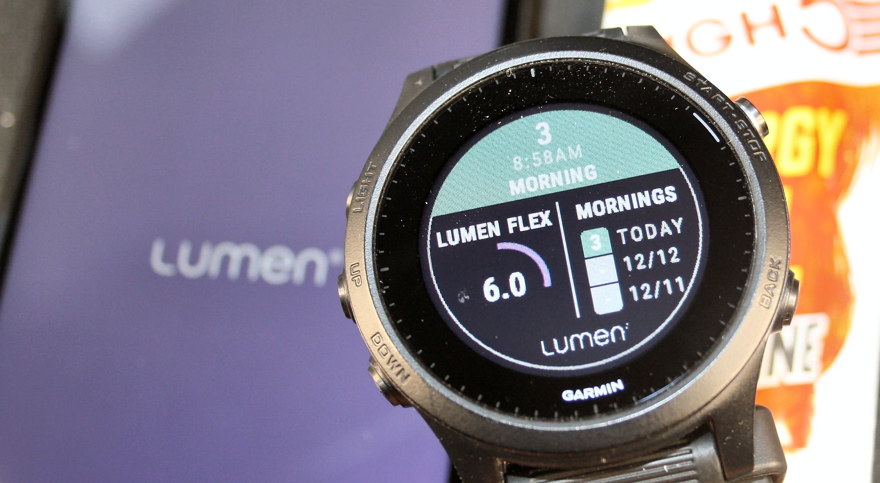
Lumen
I’m about to start using Lumen again as I contemplate ramping up my training – I found it very insightful last year and I might do a couple of HIMs this year. Lumen has excellent Garmin and Apple Watch integrations but I preferred to consume the data on my smartwatch rather than my sports watch…hence the following Apple Watch images. Essentially you can use Lumen to keep track of your body’s fat/carb-burning state whilst rested. If you are aiming for an HIM/IM or simply aiming to lose weight then knowing that what you are eating and burning is helping you to train your fat-burning abilities is very, very important.
Lumen has two scores:
- A mark out of 5. 1/5 means you are burning fat, which is good.
- A Flex score out of 21 – where 21/21 means you are really good at switching between fat and carbs as your fuel source.
Lumen definitely motivated me to be more mindful about what I eat and when I eat it as well as to see relatively quick adaptations over a few weeks to increases in endurance training volumes.
More: Lumen


HRV & Readiness-to-Train
Every morning I wake up to some very nice numbers from HRV4Training, Whoop, Oura, Training Today/Athlytic, Eight Sleep and sometimes Garmin’s Body Battery. To varying degrees, these all take my heart rate variability and give me their thoughts on my readiness to train. In each case, it’s the same heart they are working from and so you would think that they would all agree…but they don’t. I find that Whoop has the best correlation level with the consumer-grade, gold standard that is HRV4Training but on the whole, my logged subjective/feel parameters and actual HRV parameters just don’t agree.
Strangely this tells me that I should NOT listen to my body. Or, more precisely, that perhaps I should listen better 😉
I also look at Training Stress Balance (TSB) which models my readiness based on my recent training.
Here’s an old image of my CTL/ATL/TSB and this is quite a good write-up explaining it all. Although I think this particular period from 10 years ago was when I was quite fit but injury and bad recovery/tapering messed things up for me.
So I have modelled readiness (TSB), measured readiness (HRV) and RPE-based readiness (feel). Strangely, having all this data enables me to find one piece of info to suit supporting my decision of what I want to do today!! Normally it is ‘to train’ but perhaps more often it should be ‘to rest’. Anyway, I tried the ‘to rest’ bit at the back end of last year and you can see from the earlier chart that my FTP just headed Southwards for the winter. So, that wasn’t a very good idea either!
Even though these numbers don’t tally I still sagely look at them each morning to see I’m ‘ready to go’ and then limp downstairs in search of a coffee or two to get my brain working. By 11 am it’s normally out of first gear and into the day’s first piece of lycra!
I guess I could perversely argue that these numbers motivate me to do something when perhaps I sometimes shouldn’t.
Maybe I just look at WAY too many numbers.
Q: What’s your favourite motivational data?
Reader-Powered Content
 This content is not sponsored. It’s mostly me behind the labour of love which is this site and I appreciate everyone who follows, subscribes or Buys Me A Coffee ❤️ Alternatively please buy the reviewed product from my partners. Thank you! FTC: Affiliate Disclosure: Links pay commission. As an Amazon Associate, I earn from qualifying purchases.
![]()
I’ve been into collecting (actionable) data over the years, but looking back, the thing which motivates me most is to prepare my own training plan and follow it. Executing as planned brings me the biggest motivation. I should also add that I’m flexible with the planning. I have a rough skeleton what I want to do in the next 3 months, but I plan in a detail only for upcoming 1-2 weeks.
Motivation is hard to come by when all we tend to remember are the paces we ran “back then” but the comparison now-to-then rarely holds up. I’m surprised Strava doesn’t have some type of Age Grading element included (I know subscribers can see Age Groups – but not the same thing). I’m only ever interested in competing with myself on training PRs so this seems like a gap that somebody could address.
yep, i 100% agree with that.
Thanks for a glimpse into some offerings I wasn’t aware of. I’ve had a TO DO item to explore GoldenCheetah a while now. Somewhat hesitant to add more tech as the amount of time spent troubleshooting is already high enough.
As far as motivation goes I am another that keeps things going to meet or exceed goals throughout the entire year. In years gone by it was just mileage targets, then average speed crept in, now 3s average power in the prime months with TSS fencing things in.
golden cheetah is very complex…a rabbit hole
just start with loading a few months of ride and run data.
then just look at the cp chart which is a page by itself that effectively just analyses one ride/run